In honor of ggplot2 turning version 3 on CRAN I decided to make some maps of the 2010 census in Charlottesville, Virginia, to show off the new geom_sf() layer.
Packages
library(magrittr) # viva la %<>%
library(tidyverse)
Theme prep
Universal settings for all of my ggplot’s. These make typing easier and documents more consistant.
theme_set(cowplot::theme_map() +
              theme(panel.grid.major=element_line(colour="transparent")))
scale_fill_continuous <- function(...) ggplot2::scale_fill_continuous(..., type = "viridis")
Census Data
The tract level summary is available on the city’s ODP. But you could also use the tidycensus package for another city’s record.
tracts <- sf::read_sf("https://opendata.arcgis.com/datasets/63f965c73ddf46429befe1132f7f06e2_15.geojson")

tracts %<>% select(OBJECTID, area = AREA_, Population:Asian)
Let’s look at that census data now and since we have geom_sf() thowing on aesthetics is easy. Here I’ll use tracts$Population as fill.
ggplot(tracts, aes(fill = Population)) +
    geom_sf()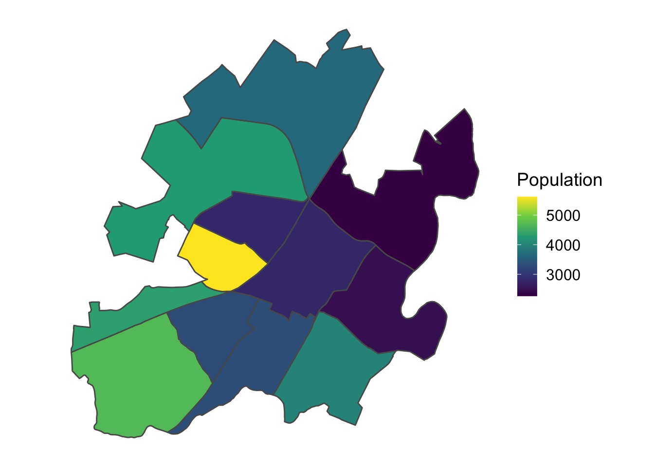
Ok that’s pretty freaking easy. No suprise that the city’s largest population is around UVA’s grounds and the Corner.
Lets’ use our favorite facets with geom_sf() to explore the racial distribution of Whites, Blacks, American Indians, and Asians in the city.
long_tracts <- tracts %>%
    gather("race", "pop", White:Asian)

ggplot(long_tracts, aes(fill = pop)) +
    geom_sf() +
    facet_wrap(~ race)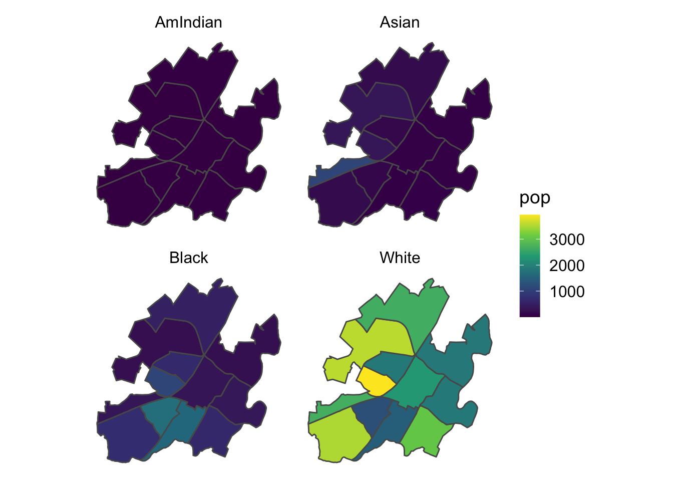
Damn, Charlottesville is really, really white.
To make a better viz about the non-white population patterns it would be nice to free the fill scales in each facet. And because this is ggplot() now, I can use on my favorite grid helper tool, cowplot::plot_grid(). Any alternatives, like gridextra, egg or patchwork, are on the table too.
long_tracts %>%
    split(.$race) %>%
    map(~ ggplot(., aes(fill = pop)) +
            geom_sf() +
            facet_wrap(~race) ) %>%
    cowplot::plot_grid(plotlist = .)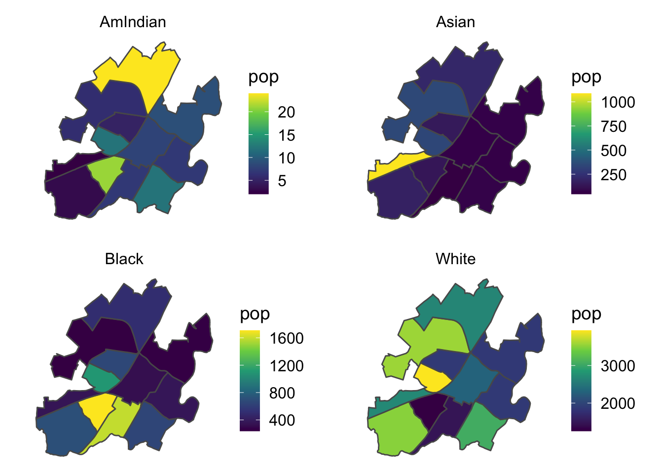
That’s pretty fast and now we have a much better picture of each race’s distribution in the city.
Being able to manipulate and make maps with the tidyverse is awesome. Working with ggplot2 layers is straight forward and there already exist a ton of accessory packages, like cowplot that make formatting these ggobjects straight forward too!