gg_interaction_plot
April 30, 2018 - 5 minutes
Friendly syntax for a investigating interaction in models.
Modeling ggplot2Intro
This function/post was inspired by reading Linear Models with R by Julain Faraway, which I highly reccomend.
Interaction plots are powerful tools when building models when you have a single response of interest and mulltiple predictors to choose from. Being able to visually detect interactions between predictors is key for building good models. While this topic doesn’t come up until the end of the book in Chapter 16: Models with Several Factors, it is applicable to a ton of industries from quality control and clinical trials.
Since I do a lot of modeling and am a huge fan of typing as little as I can, I set out to write a kind and light wrapper around the more “advanced” interaction plots Faraway builds with by hand with ggplot2(), something that I could use in my exploratory analysis workflow.
PVC
Is a dataset in library(faraway), that describes a PVC production study to test the effects of resin (manufacutring machine) and operator (employee) on psize (particle size). PVC particle size varies based on synthesis method and low variance in particle size is preferred. Different applications of piping can call for differnt particle sizes, so smaller or larger isn’t always better.
data(pvc, package = "faraway")
str(pvc)
## 'data.frame': 48 obs. of 3 variables:
## $ psize : num 36.2 36.3 35.3 35 30.8 30.6 29.8 29.6 32 31.7 ...
## $ operator: Factor w/ 3 levels "1","2","3": 1 1 1 1 1 1 1 1 1 1 ...
## $ resin : Factor w/ 8 levels "1","2","3","4",..: 1 1 2 2 3 3 4 4 5 5 ...I see 3 unique operators/employees and 8 types of resin railcars, the piece of equipment used to produce the PVC.
Given that this study was about large manufacturing process, and let’s say we wanted the smallest particle size possible in our next batch using a single resin. We might not select the abosolute lowest resin in terms of mean, if there was a close second with a much smaller variance.
Faraway’s method #1
With the base R plotting system we could do this.
par(mfcol = c(1,2))
plot(psize ~ operator, pvc)
plot(psize ~ resin, pvc)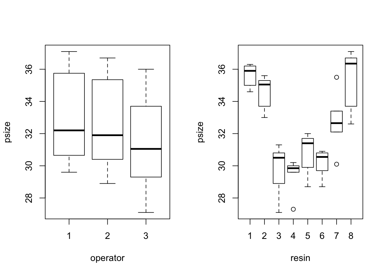
# or
with(pvc, interaction.plot(operator, resin, psize))
with(pvc, interaction.plot(resin, operator, psize))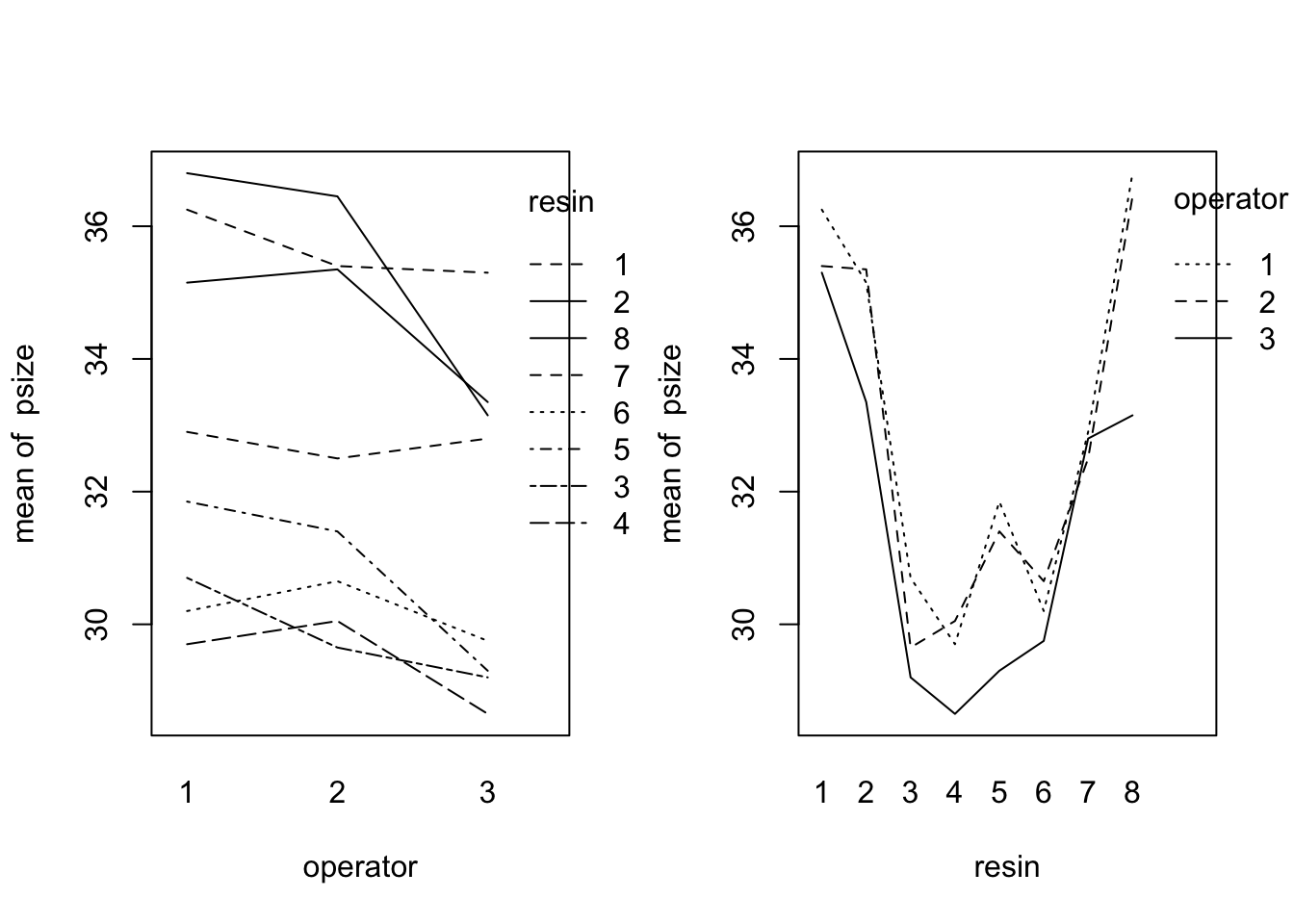
Both of these options are fast but we don’t get to see the individual data points.
Base plotting is great for speed and simple syntax, but if we want to start adding in custom colors and shapes, I think (and so does Faraway!) that it’s easier to move to ggplot2. Plus remembering how to use par() sucks
Faraway’s method #2
Faraway proposes building plots almost exactly like this for a more informative interaction plot experience.
library(ggplot2)

p <- ggplot(pvc, aes(x = operator, y = psize, shape = resin)) +
    geom_point(size = 3) +
    scale_shape_manual(values = 49:56) + # need extra shapes
    stat_summary(fun.y = "mean", geom = "line", aes(group = resin))
## Warning: `fun.y` is deprecated. Use `fun` instead.p2 <- ggplot(pvc, aes(x = resin, y = psize, shape = operator)) +
geom_point() +
stat_summary(fun.y = "mean", geom = "line", aes(group = operator))## Warning: `fun.y` is deprecated. Use `fun` instead.cowplot::plot_grid(p, p2, align = "hv") # my adlib package for combining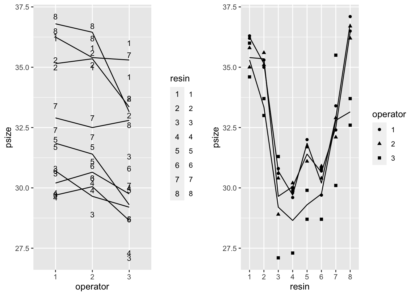
While it is a lot nicer to see both factors simultaneously. I don’t like that I’m still are stuck manually flipping variables, typing a bunch of custom code each time and combining the plots after the fact.
So, hello to our newest function friend gg_interaction_plot!
gg_interaction_plot()
This function’s goals were:
- minimize typing (and inevitable typos) from switching variables
- be flexible
library(tidyverse)
gg_interaction_plot(pvc, psize ~ operator + resin)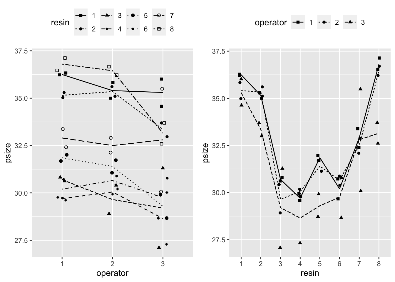
I love R’s formula syntax and think using the same syntax as lm() makes a lot of sense for a modeling work flow. The only difference I made was switching the order, so that data comes first. This is a core pattern of tidyverse functions and makes working with %>% easier.
Consistantly parsing formulas is straight forward and by adding in a of sprinkle aes_(), to pass character strings into ggplot(), I now have access to quick and pretty plots!
Warpbreaks
Another example using warpbreaks which looks at industrial weaving and studies the effect of wool type and tension on the number of warp breaks per fixed length. The data set contains breaks, the response variable and two predictors wool and tension.
data(warpbreaks)
warpbreaks %>%
    gg_interaction_plot(breaks ~ wool + tension)
## Warning: `fun.y` is deprecated. Use `fun` instead.
## Warning: `fun.y` is deprecated. Use `fun` instead.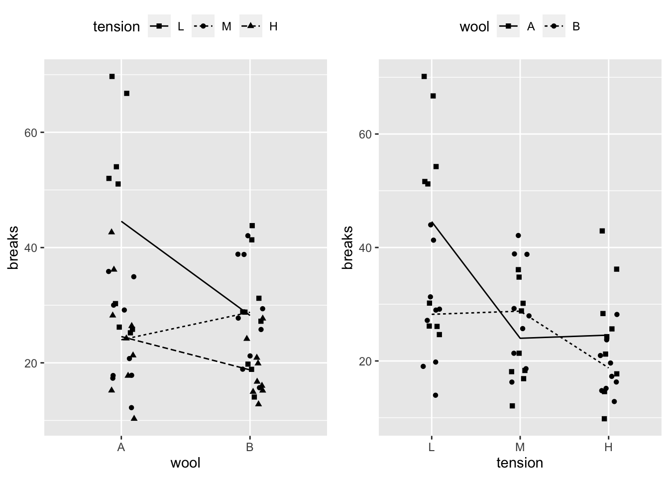
src
gg_interaction_plot <- function(data, formula) {

    formula <- as.formula(formula)

    y_var <- as.character(formula[2])

    x_vars <- as.character(formula[3]) %>%
        str_split(" \\+ ") %>% unlist()

    data <- mutate_at(data, x_vars, as.factor)

    shp_vars <- rev(x_vars)

    map2(x_vars, shp_vars,
         ~ ggplot(data, aes_(y = as.name(y_var), x = as.name(..1), shape = as.name(..2))) +
             geom_point(position = position_jitter(width = .1)) +
             stat_summary(fun.y = "mean", geom = "line",
                          aes_(group = as.name(..2), linetype = as.name(..2))) +
             scale_shape_manual(values = 15:25) +
             theme(legend.position = "top", legend.direction = "horizontal")) %>%
        cowplot::plot_grid(plotlist = ., align = "hv")

}
Right now the function is limited to representing 11 factor levels (shapes) at a time, which is enough for most cases but not everything. Also the function currently coherces all predictor variables to factors, which might not always be the best representation, but its often a reasonable first step for model selection.