Parking Meter Pilot
February 24, 2018 - 14 minutes
A vizual introductuion to stats and trends of the city's cancelled Downtown mall parking meter program.
R EDA Cville Open Data data wrangling dates time series tidyverseIntro
On January 2nd, 2018, Charlottesville City Council voted to end the Downtown parking meter pilot, and now the data is available on the City’s Open Data Portal. This program began last year, on September 5th, with 105 on street spots around the Downtown mall. It took a holiday break starting mid November and was supposed to resume in 2018 and run until March 5th.
The numbers show that the city collected $51,000, despite the abbreviated study, but this is likely not enough to cover the remaining expenses like repairing vandalism and paying the survey designers. This makes the premature end to the pilot program mildly disturbing. Why would the city want to shoot itself in the foot and take a loss when the numbers showed a strong successful start?
The original aim of the meters was to improve short term parking access by getting longer term parkers to use the parking decks more. Downtown business owners have had concerns about the negative impact these meters might have on their livelihoods from the beginning of the pilot.
I want to see if there are any trends in this data that support the business concern or the decision to end the program early.
Packages
library(geojsonio) # get ODP data
library(leaflet) # maps
library(viridis) # colors
library(ggsci) # more colors
library(magrittr) # %<>% is great for cleaner code
library(lubridate) # tidyverse time date fxns; doesn't auto-load tho
library(tidyverse) # yep
Data In
There are two “Parking Meter” data links on the ODP, “Pilot Data” (everything) and “Pilot Locations” (subset with only lat/lon cordinates). So we need “Pilot Data” to explore revenue trends and patterns, which is ~27,000 rows (5.1 MB). I like using the GeoJSON API with geojsonio to pull data from the portal, but you could just as easily download the CSV file and use read.table() instead.
dat <- geojson_read("https://opendata.arcgis.com/datasets/d68e620e74e74ec1bd0184971e82ffaa_14.geojson",
                    parse = TRUE) %>%
    .[["features"]] %>%
    .[[2]]

str(dat)
'data.frame': 27968 obs. of 17 variables:
$ RecordID : int 1 2 3 4 5 6 7 8 9 10 ...
$ Bills : int 0 0 0 0 0 0 0 0 0 0 ...
$ Card : num 0 1.8 2.1 3.6 1.8 3.6 2.7 1.8 1.8 3.6 ...
$ Coins : num 0 0 0 0 0 0 0 0 0 0 ...
$ Date_Payment : chr "2017/09/15 00:00:00+00" "2017/09/15 00:00:00+00" "2017/09/15 00:00:00+00" "2017/09/15 00:00:00+00" ...
$ InvalidCoins : chr "" "" "" "" ...
$ LicensePlateAnon : chr "8532" "7086" "3669" "5625" ...
$ Meter_Lat : num 38 38 38 38 38 ...
$ Meter_Long : num -78.5 -78.5 -78.5 -78.5 -78.5 ...
$ MeterType : chr "Multispace" "Multispace" "Multispace" "Multispace" ...
$ ParkingEndTime : chr "09/15/2017 02:36:11 PM" "09/15/2017 03:32:19 PM" "09/15/2017 03:40:58 PM" "09/15/2017 03:53:25 PM" ...
$ SpaceName : chr "MS12" "MS12" "MS12" "MS12" ...
$ TimePurchased : chr "00:00:00" "01:00:00" "01:10:00" "02:00:00" ...
$ Total : num 0 1.8 2.1 3.6 1.8 3.6 2.7 1.8 1.8 3.6 ...
$ TotalParkingTime : chr "00:00:00" "01:00:00" "01:10:00" "02:00:00" ...
$ TransactionStatus: chr "" "Approved" "Approved" "Approved" ...
$ TransactionType : chr "Credit Card" "Credit Card" "Credit Card" "Credit Card" ...names(dat) %<>% tolower() # I just think lower-case is easier to typeJust from the column names we can see the data has everything we need to investigate the temporal patterns in usage and revenue, but because all of the columns are either character or numeric, we need to do some cleaning first.
In order to really explore this data set properly, we need to build some POSIXct class columns for date and time. Since there are multiple columns describing time and date, I choose to just use “ParkingEndTime” as the starting material for consistancy.
# split column into date, clock:time, AM/PM parts
tmp <- strsplit(dat$parkingendtime, " ")

# get dates
dat$date <- map_chr(tmp, ~.[1]) %>%
    as.POSIXct(format = "%m/%d/%Y")

# get times
dat$time <- map_chr(tmp, ~.[2]) %>% # get clock:time from each 2nd slot
    as.POSIXct(format = "%H:%M:%S")

# convert to 24hr clock
pm_add <- ifelse(grepl("PM", dat$parkingendtime) & !grepl(" 12:", dat$time), #
                 43200, # 12 hours = 43200 seconds
                 0)
dat$time %<>% add(pm_add)
Now we have the columns we need to start visualizing.
Explore
Let’s start by looking at the usage timeline of all the meters for the duration of the program. I think it makes sense to use weeks as the grouping varaible and lubridate::isoweek makes it easy to calculate the week number from begining of the year.
dat$week <- isoweek(dat$date) %>% as.factor()

ggplot(dat, aes(week)) +
    geom_bar()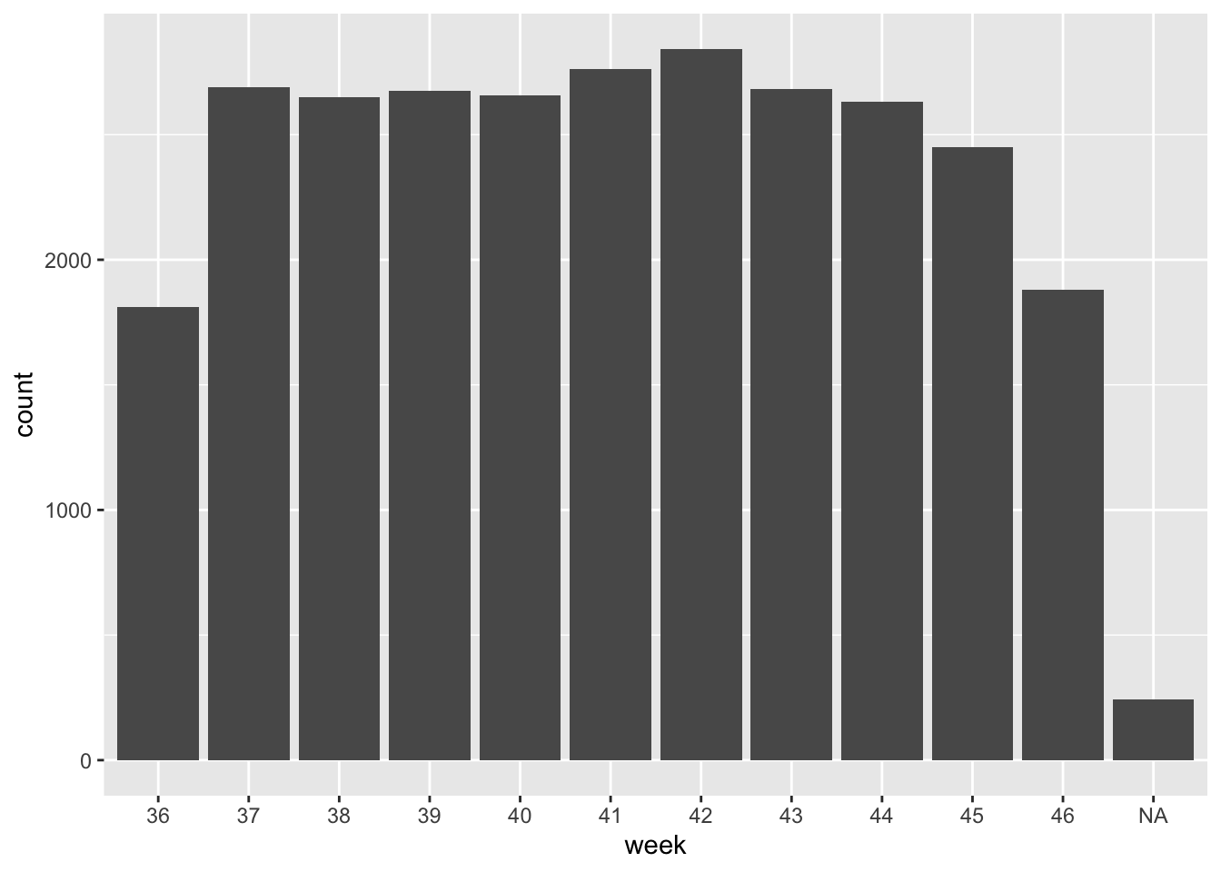
Here we are looking at just the counts of meter transactions and we see constant usage over the course of the program data. The first and last weeks, #36 and #46 are missing days, so they appear lower than average.
Before we go any further we need to find out where those NA values came from.
NA investigation
NAs are a nice helper in data exploration. I like to think of them as data mining’s equivalent to the carnary in a coal mine., because they alert you to missing or (more often in my case) mistaken data.
filter(dat, is.na(week)) %>% head(5) recordid bills card coins date_payment invalidcoins
1 452 0 0 -36.10 2017/09/26 00:00:00+00 0
2 525 0 0 -33.95 2017/09/14 00:00:00+00 0
3 591 0 0 -12.15 2017/11/16 00:00:00+00 0
4 630 0 0 -33.40 2017/11/09 00:00:00+00 0
5 686 0 0 -27.55 2017/11/02 00:00:00+00 0
licenseplateanon meter_lat meter_long metertype parkingendtime spacename
1 N/A 38.03142 -78.481 Singlespace <NA> 0S1E
2 N/A 38.03142 -78.481 Singlespace <NA> 0S1E
3 N/A 38.03142 -78.481 Singlespace <NA> S1W
4 N/A 38.03142 -78.481 Singlespace <NA> S1W
5 N/A 38.03142 -78.481 Singlespace <NA> S1W
timepurchased total totalparkingtime transactionstatus transactiontype date
1 <NA> -36.10 <NA> Collect. Card <NA>
2 <NA> -33.95 <NA> Collect. Card <NA>
3 <NA> -12.15 <NA> Collect. Card <NA>
4 <NA> -33.40 <NA> Collect. Card <NA>
5 <NA> -27.55 <NA> Collect. Card <NA>
time week
1 <NA> <NA>
2 <NA> <NA>
3 <NA> <NA>
4 <NA> <NA>
5 <NA> <NA>Here I used head() for breviety in the markdown but in RStudio I could use View() instead.
Looks like all of these transactions are the same type “Collect. Card” and all of them are negative balance transactions occuring at midnight. But let’s be sure.
filter(dat, is.na(week)) %>% with(table(transactiontype)) # yep all of themtransactiontype
Collect. Card
241 filter(dat, is.na(week)) %>% with(range(total)) # all negative or zero[1] -255.65 0.00filter(dat, is.na(parkingendtime)) %>% with(mean(total)) # average of -$31[1] -31.61888I’m not 100% what these “Collect. Card” transactions represent, but I’m guessing they are batched meter fee collections. Not sure why they would be included in the data set, but going with my gut, I’m going to drop them.
dat %<>% filter(transactiontype != "Collect. Card")This is a good example of oddities in raw data and how NA values can be clues to look deeper.
Weekly revenue
Now that the missing values are removed, we want to look at the actual revenue, because let’s face it 💰 talks.
week_rev <- group_by(dat, week) %>%
    summarise(revenue = sum(total)) %>%
    slice(c(-1, -n())) # drop first & last week
`summarise()` ungrouping output (override with `.groups` argument)ggplot(week_rev, aes(week, revenue)) +
geom_col()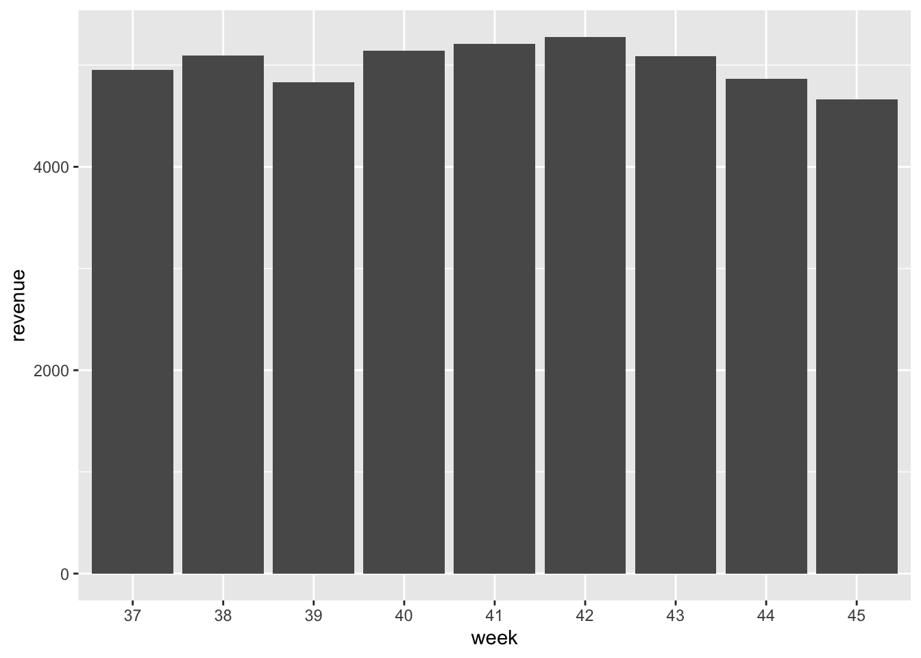
Remember how local business owners were worried about the meters reducing traffic to their establishments? While we don’t have the business records (that’d be cool), we do not see a decreasing pattern in revenue from the metered spots. It looks like people continued using the spaces (and likely the Downtown mall businesses) despite the new cost.
Next let’s look at what a typical meter fee was. The total column has this data in it.
mean(dat$total) # average fee[1] 1.855765hist(dat$total) # distribution of fees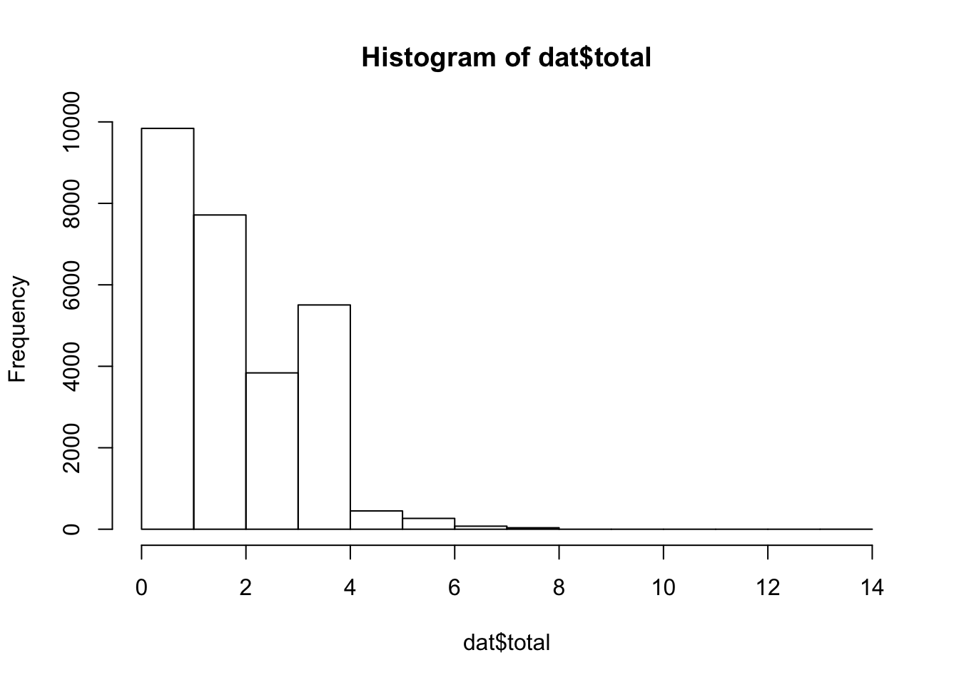
sum(dat$total) # total revenue[1] 51454.79The average meter bill was $1.85, just north of the hourly rate $1.80 and people rarely paid over $4, or stayed over two hours. Most of the acitivities found on the Downtown mall, from concerts to restraunts, are going to cost a little more than $2, so this small fee probably wasn’t a deal breaker for people looking to park conveniently.
The meters collected more than $50,000 dollars over the <11 weeks they were in operation, meaning they paid themselves in just over two months. So it seems like the meters were encouraging shorter parking times and making a bunch of 💸!
Average Week
If our haunches are correct and people are coming to the Downtown mall for food or fun, we would expect meter traffic to increase at lunch, dinner, and on the weekends. Lets look at which weekdays are busiest with lubridate::wday() to see if the weekends are actually busier. Parking remained free on Sundays so those days have been dropped here.
dat$day <- wday(dat$date, T)

# no one usese meters on Sundays.
dat %<>% filter(day != "Sun")

ggplot(dat, aes(day)) +
    geom_bar()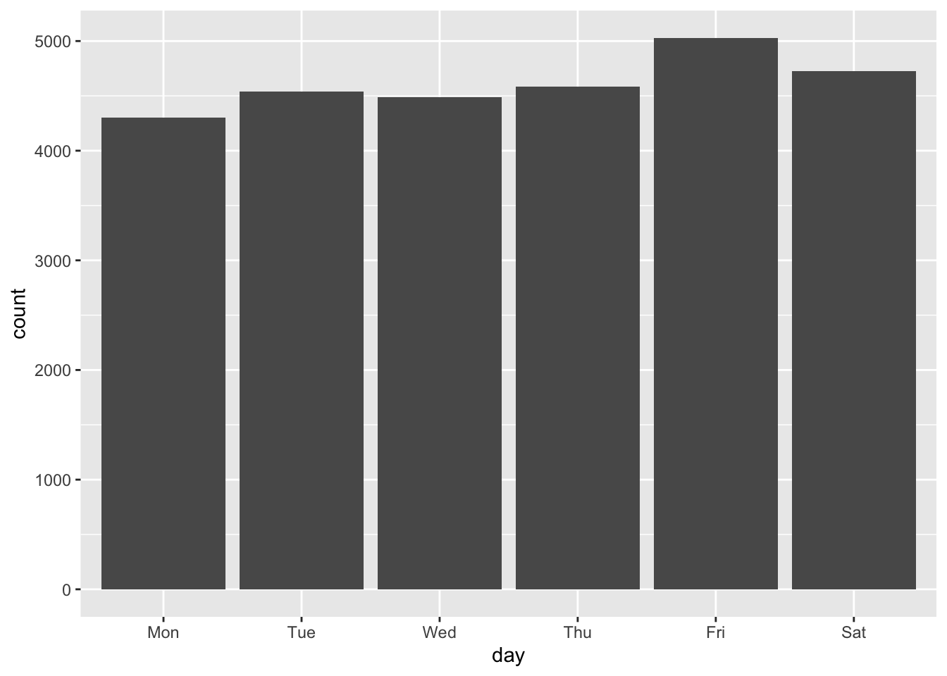
That was just the counts, but sure enough the weekend sees more meter usage and hardly anyone uses the meters on Sunday. Let’s double check and look at revenue.
rev_by_day <- group_by(dat, day) %>%
    summarise(revenue = sum(total))
`summarise()` ungrouping output (override with `.groups` argument)ggplot(rev_by_day, aes(day, revenue)) +
geom_col()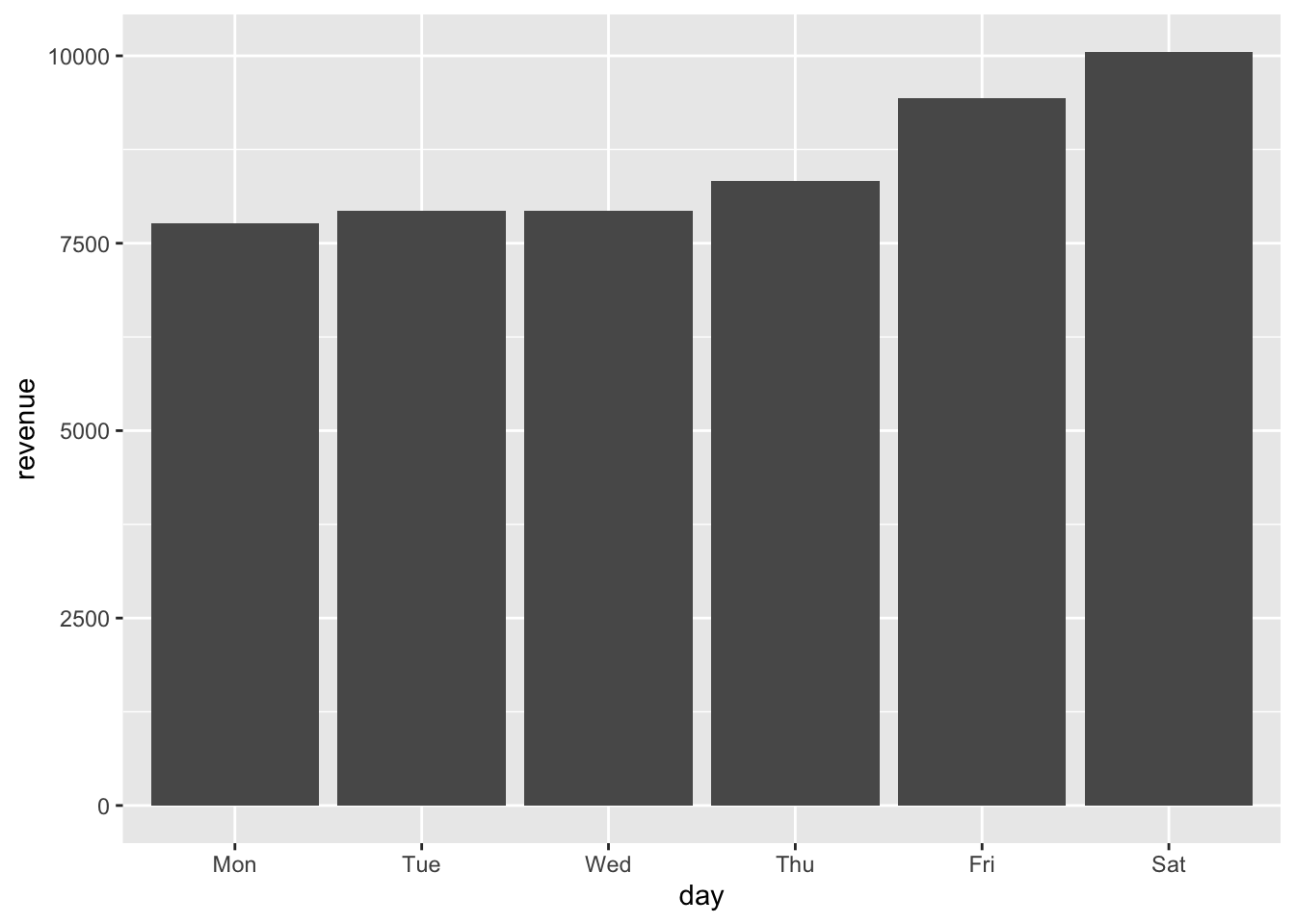
Here we see an even stronger signal of increased weekend usage. Saturday is the largest earner, followed by Friday, then Thursday. Looks like when people are going to the mall for recreation they don’t mind using the metered spots.
Average Day
To look for time of day patterns in meter usage, let’s use lubridate::hour() to extract the hour from our POSIXct times. The meters are only required payments between 8a and 8p, parking was free outside of that window.
dat$hour <- hour(dat$time)

ggplot(dat, aes(hour)) +
    geom_bar() +
scale_x_continuous(limits = c(7, 21), breaks = c(8,12,17,20), labels = c("8a", "12p", "5p", "8p"))Warning: Removed 28 rows containing non-finite values (stat_count).Warning: Removed 2 rows containing missing values (geom_bar).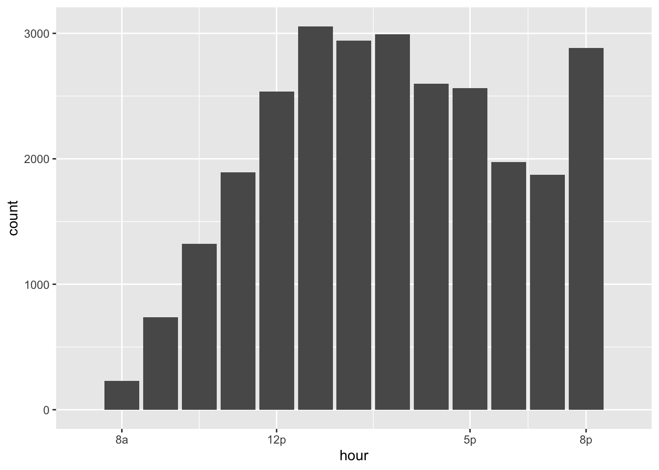
We can see an increase in meter activity at lunch time and a big spike at 8pm, right before the metered hours expire. It looks like the 8p cutoff is only catching the begining of the evening traffic to the Downtown mall. I wonder if the meters would capture a lot more revenue if the program was extended until 10pm or even midnight?
Let’s check the revenue numbers for each hour.
group_by(dat, hour) %>%
    summarise(rev = sum(total)) %>%
    ggplot(aes(hour, rev)) +
    geom_col() +
    scale_x_continuous(limits = c(7, 21), breaks = c(8,12,17,20), labels = c("8a", "12p", "5p", "8p"))
`summarise()` ungrouping output (override with `.groups` argument)Warning: Removed 4 rows containing missing values (position_stack).Warning: Removed 2 rows containing missing values (geom_col).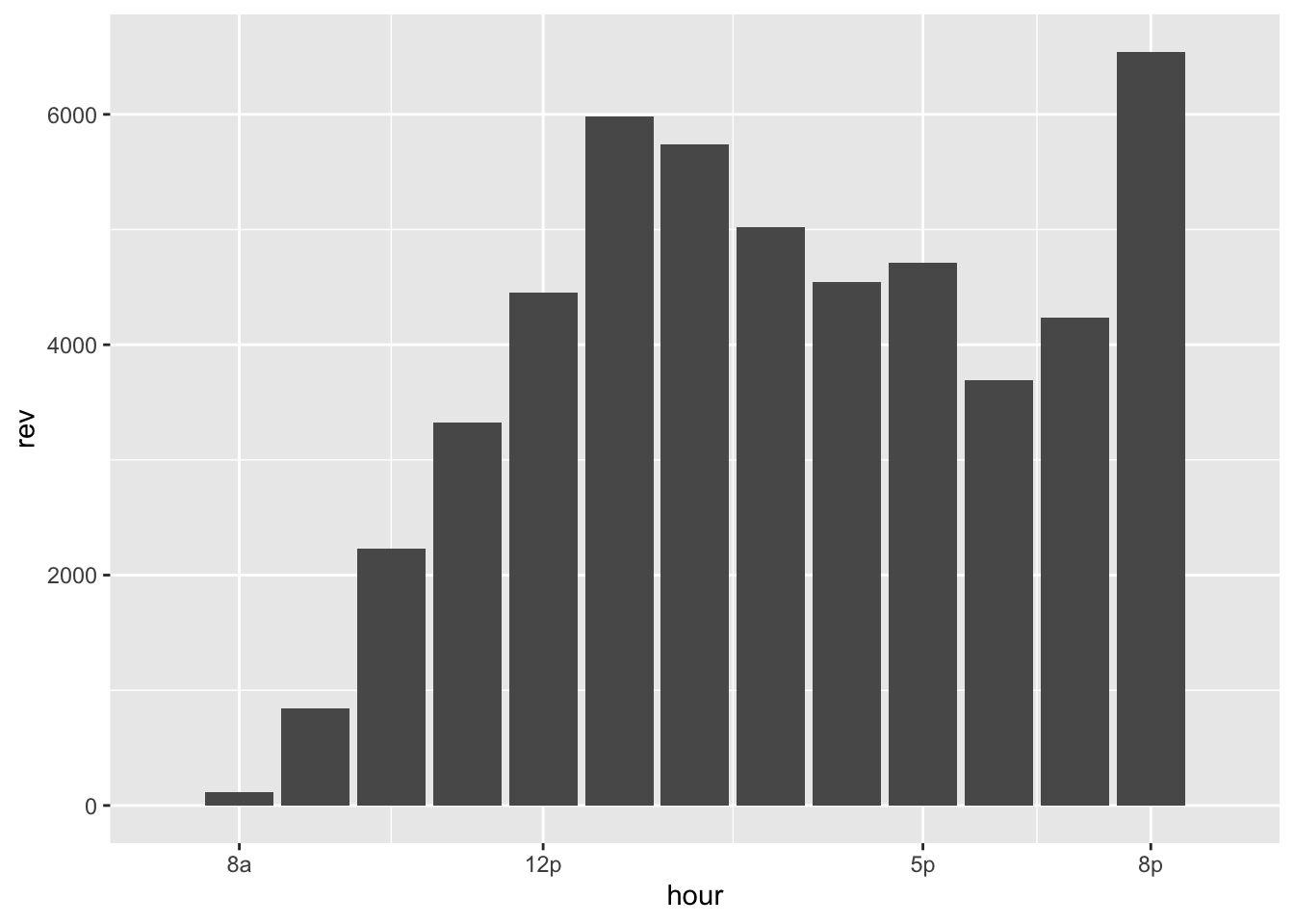
The revenue numbers show the 8pm spike is bigger than the counts indicated. Extending the metered hours to cover more of peak evening mall activity looks like an even better idea. The 8pm-10pm window would likely produce some high revenue numbers, assuming the evening rush has a similar pattern to the lunch time one.
Different days
We might expect that the evening spike is largest on the weekends because most people don’t hit the bars or go out for dinner early in the week. Also I would expect lunchtime peak is sharpest earlier in the work week, when people are on tighter schedules.
To get a better idea, we can take advantage of hour and day to group on.
# look at hour and day
group_by(dat, hour, day) %>%
    summarise(revenue = sum(total)) %>%
    ggplot(aes(hour, revenue, colour = day, group = day)) +
    geom_path(size = 1.5) +
    scale_color_d3()  +
scale_x_continuous(limits = c(7, 21), breaks = c(8,12,17,20), labels = c("8a", "12p", "5p", "8p"))`summarise()` regrouping output by 'hour' (override with `.groups` argument)Warning: Removed 9 row(s) containing missing values (geom_path).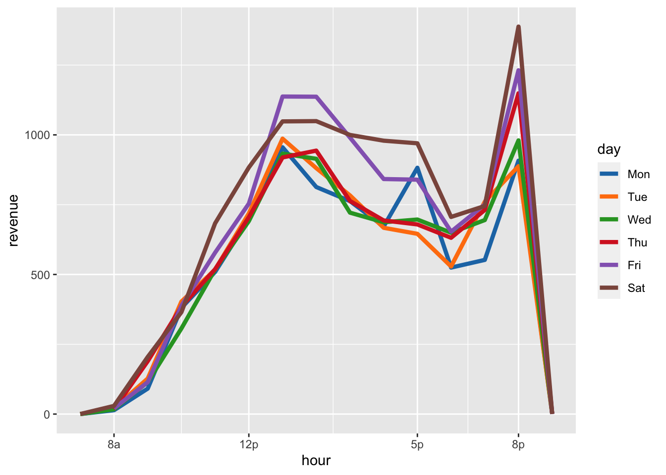
This is great because we can see the evening meter revnue spike happen every single day, but the biggest spikes belong to Saturday, Friday, and Thursday - like we expected.
Our other hypothesis of a steady increase in lunch time traffic through out the week is visable too. We see the most lunch traffic on Friday than other days - who doesn’t like a nice Friday office escape to enjoy a tasty lunch?
I think the spike on Monday at 5p is interesting, perhaps it’s people hitting happy hour to help soothe their new found case of the Mondays?
Money meters
This pilot included 105 metered spaces around the downtown mall, and this data set identifies spaces by their spacename, of which there are 41. Each of these represents either one or multiple spaces and that info is stored in metertype. Unfortunatly there is no data indicating how many spaces belong to a given meter 😞. So we need to be careful when looking for high revenue meters, to make sure we aren’t just identifying the meters with the most spaces.
space_rev <- group_by(dat, spacename, metertype) %>%
summarise(total_revenue = sum(total))`summarise()` regrouping output by 'spacename' (override with `.groups` argument)ggplot(space_rev, aes(spacename, total_revenue)) +
geom_col() +
facet_grid(~metertype, scales = "free_x", space = "free_x") +
theme(axis.text.x = element_text(angle = 90, vjust = .5)) # to be able to read it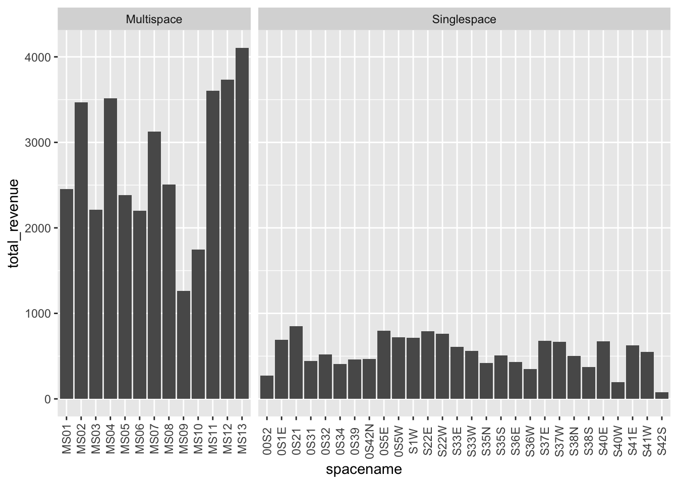
We have a lot more single space meters than multi-space ones and sure enough multi-space meters generate more revenue, who woulda’ thought?
The spacenames don’t tell us anything useful about the location of the spaces, but remember this data set comes with lat/lon coordinates for each meter. Let’s look at a map of the meters to see where the busiest ones were located.
I’m going to use color to show log2(revenue) and use size to show metertype. Transforming with log2 helps normalize the distribution of revenue and prevent the multispace meters from soaking up most of our color range.
space_rev <- group_by(dat, spacename, metertype, meter_lat, meter_long) %>%
summarise(revenue = sum(total))`summarise()` regrouping output by 'spacename', 'metertype', 'meter_lat' (override with `.groups` argument)pal <- colorNumeric(
palette = "viridis",
domain = log2(space_rev$revenue))
leaflet(space_rev) %>%
addProviderTiles("OpenStreetMap.BlackAndWhite") %>%
addCircleMarkers(lat= ~meter_lat, lng= ~meter_long,
color = ~pal(log2(revenue)),
radius = ~ifelse(metertype == "Singlespace", 10, 20)) %>%
addLegend("bottomright", pal = pal, values = ~log2(revenue),
labFormat = labelFormat(transform = function(x) 2^x),
title = "$USD Revenue") %>%
widgetframe::frameWidget(height = '400')We see the multi-space meters along Market Street make the most money. But is it really because they just have more spaces? While we don’t have actual sub-space counts, we can do an approximation, assuming the number of sub-spaces is the same for each multi-space meter.
Note: I’m not using the log2 transformation anymore, since the values are well distributed in linear space.
table(space_rev$metertype)
 Multispace Singlespace
         13          28
avg_spaces <- (105 - 28) / 13
space_rev %<>% mutate(avg_space_revnue = ifelse(metertype == "Singlespace",
revenue,
revenue / avg_spaces))
pal <- colorNumeric(
palette = "viridis",
domain = space_rev$avg_space_revnue)
leaflet(space_rev) %>%
addProviderTiles("OpenStreetMap.BlackAndWhite") %>%
addCircleMarkers(lat= ~meter_lat, lng= ~meter_long,
color = ~pal(avg_space_revnue),
radius = ~ifelse(metertype == "Singlespace", 10, 20)) %>%
addLegend("bottomright", pal = pal, values = ~avg_space_revnue,
title = "$USD Revenue") %>%
widgetframe::frameWidget(height = '400')That image looks more balanced than before, now that we are looking at the total revenue per estimate spot. We don’t see the same multi-space Market St bias and now it looks like the meters were used evenly across locations. The two highest earning spots are on the corner of Market and 2nd NW, closest to Felleni’s. Which makes sense, Felleni’s is awesome.
Conculsion
This data set shows us a lot about when people were parking at the mall meters. We see meter usage was steady across the pilot, which is counter to the concerns of businesses that the meters would decrease mall traffic. We also still see lunch, dinner, and weekend spikes, indicating people don’t mind feeding a meter, if it means getting a good spot close to their destination. It would be great to get some business revenue data from the same time period, to see the other side of the story, but from here it doesn’t appear that the meters were hurting mall traffic.
This data set also shows that the meters were distributed well as revenue was fairly consistant across spots. I would love to have the actual multi-space breakdown for sub-spaces, but even without that we see only a few under utilized meters.
The decision to stop the program doesn’t seem to have stong data support, I would love to know what information the council had before their vote. Let’s estimate how much money the program would generate if it ran for a full year, without a holiday break, based on the 9 weeks of full data.
mean(week_rev$revenue) * 52 # weeks[1] 260710More than $250,000 dollars! Even if the city’s annual expense to maintain the meters was half of their original cost or $25,500, that would still be a huge chunk of change avaialble to support the city’s schools or future improvements.
Overall this looks like Charlottesville missed an opportunity here, but I don’t have all the data. I really hope the city council did. It would be a small let a small cohert of angry and loud meter opponents sabotage a steady source of revenue for the city, with just emotion and not real data.