Spatial viz of drug crime
December 30, 2017 - 14 minutes
Using library(sf) to visualize the spatial distribution of drug related crimes in Chalottesville
Cville Open Data geocode sf spatial####
Intro
Using data originally sourced from the Charlottesville Open Data Portal, I made a geocoded version of the Police Reports dataset (available as a csv on my Github repo here) to look for spatial patterns. In this post I’m using the very tidy library(sf) to do some filtering and viridis visualizations to search for locations with highl drug crime.
Historically working with spatial data in R revolved around using library(sp)and its special S4 classes, like “SpatialPolygonsDataFrame”. The biggest reason I am excited about library(sf) is its new sf objects. These things are extended S3 dataframes, or tibbles!, with a list column for storing the spatial geometries as simple features. Simple features are a standard format for planar geometries recognized by Open Geospatial Consortium (OGC) and International Organization for Standardization (ISO).(Wikipedia). And that means using all my favorite tidyverse tools for exploratory data analysis are just one %>% away!!!
# the library ---------------------------------------------------------------
library(sf) # tools for simple features
library(geojsonio) # API access
library(viridis) # pretty colors
library(leaflet) # ineteractive maps
library(cowplot) # grid ggplots
library(tidyverse) # always
library(magrittr) # %<>% life

theme_set(theme_void() +
              theme(panel.grid = element_blank()))
Data In
The first piece of data we need is the geo-coded version of the police reports dataset that Google Maps and I made in my last post. You can download the csv file locally or use the raw.githubusercontent.com domain to download directly via URL from Github.
crime <- read_csv("https://raw.githubusercontent.com/NathanCDay/cville_crime/master/crime_geocode.csv")

crime %<>% filter(complete.cases(crime)) # not all of the records could be geo-coded

names(crime) %<>% tolower() # easy typing
In case you missed the last post, geo-coding and manual data entry are both messy businesses. Not every address in the police reports can be accurately geocoded, but in the name of transparency my geo-coded version retains these missed locations to match the original.
The second data piece we need is the 2010 US Census Block Group Areas for Charlottesville, Virginia, to spatially filter the reports, to those within the city limits and use population as a normalization factor to crime counts. Using library(geojsonio) makes grabbing this data directly from the ODP’s API a piece of cake.
census <- geojson_read("https://opendata.arcgis.com/datasets/e60c072dbb734454a849d21d3814cc5a_14.geojson",
                       what = "sp") # a Spatial object (list)

census %<>% st_as_sf() # convert to sf

names(census) %<>% tolower()

census %<>% select(objectid, area = area_, population, geometry) # keep only a few variables
In spatial analysis, coordinate referense systems (CRS) are critical when working with multiple data sources. It is required that the CRS values match to perform any sort of spatial computations between objects. Since census was downloaded as geoJSON data, it already has a CRS assigned. We will use that for the setting the CRS of crime and be done with the data read ins.
crs_val <- st_crs(census) # returns CRS

crime %<>% st_as_sf(coords = c("lon", "lat"), # define coordinate variables
                    crs = crs_val) # set CRS to match census
Spatial viz
The second biggest reason to be excited about library(sf) is geom_sf(), which is in the development version of library(ggplot2). This special geom is designed specifically for plotting sf objects, duh, meaning now we can stay in the land of layers and coninue avoiding plot() like the plauge.
Because plotting ~31,000 points is really slow, let’s look at the data a just sumaries of unique addresses only, ~3,000 points. Remember the addresses in this dataset are only reported to the hundred block level, so we expect to have multiple reports from single points.
# install dev ggplot2
# library(devtools)
# install_github("tidyverse/ggplot2")

ggplot(census) +
    geom_sf(data = group_by(crime, address) %>% slice(1) %>% ungroup(), # only unique addresses
            alpha = .1, color = viridis_pal()(3)[1], size = 1) +
    geom_sf(color = NA, fill = viridis_pal()(3)[3], alpha = .75) +
    coord_sf(crs = st_crs(census), datum = NA) # remove grid lines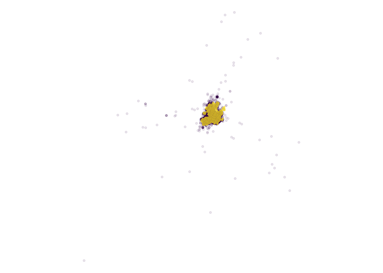
We can see that we have a large dispersion of reported addresses, but the highest concentration is within the city or just outside. To focus on the crime patterns within the city we’ll drop the reports outside of the yellow census block areas.
Spatial fitler
To check which crime points fall within the city’s census blocks, we can use st_within(). This will return the block id each point falls within and code those that don’t make it into a block as NAs, which we want to drop.
crime$within <- st_within(crime, census) %>% # returns a list with all elements length 1
                      as.numeric() # coherce for NAs (failed overlap)

nrow(crime) # 31888## [1] 31888crime %<>% filter(!is.na(within))
nrow(crime) # 31034## [1] 31034ggplot(census) +
geom_sf(color = NA, fill = viridis_pal()(3)[1]) +
geom_sf(data = group_by(crime, address) %>% slice(1) %>% ungroup(),
alpha = .1, color = viridis_pal()(3)[3]) +
coord_sf(crs = st_crs(census), datum = NA)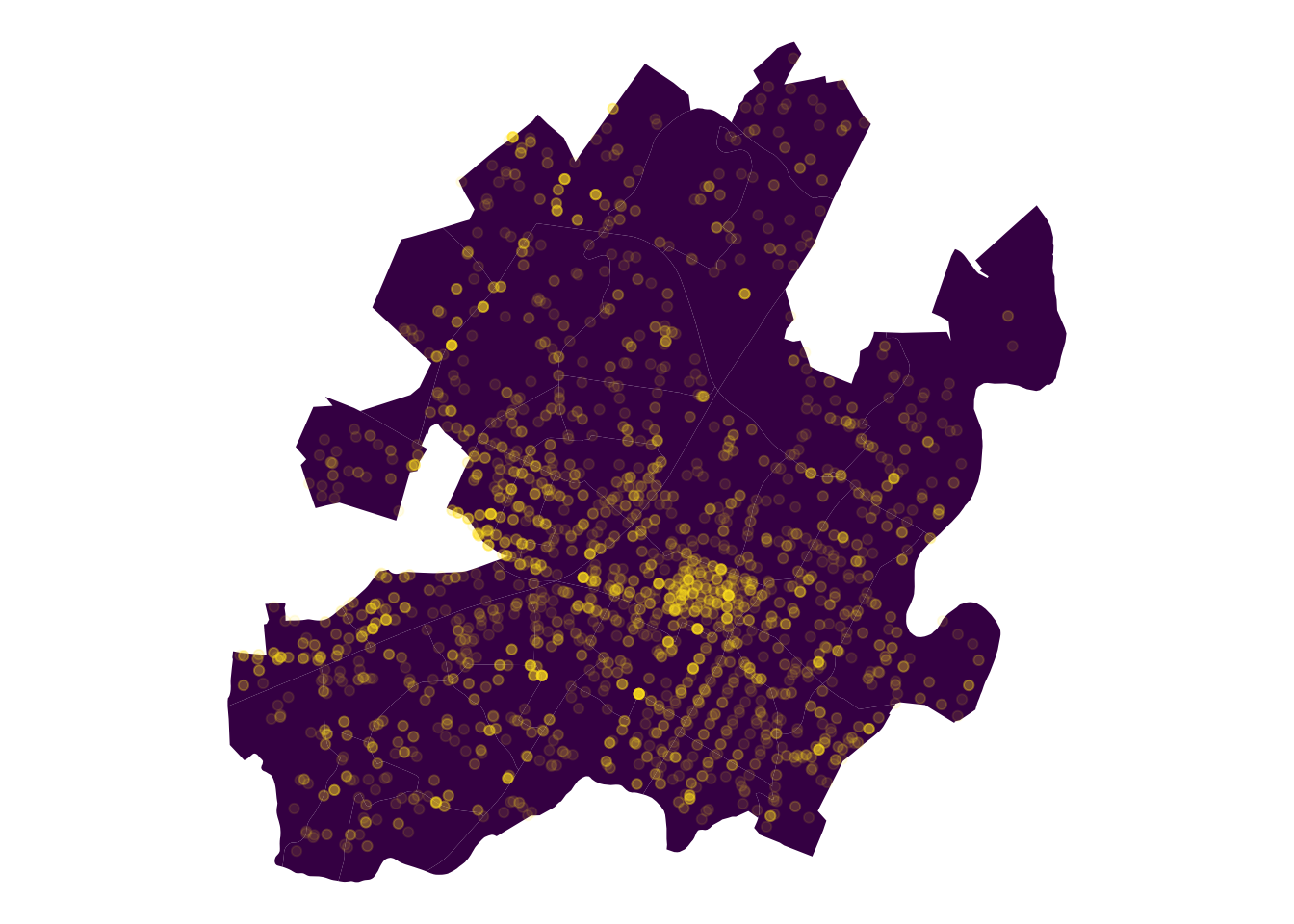
That looks better and we only lost ~800 reports.
Now that we have only the police reports from within the city, we can already see areas around the downtown mall and UVA corner with high counts of total crime. But crime is expected to be proportional to population, so it makes sense and isn’t an immediate concern.
Flag drug crime
To get a closer look at drug crime we need a good flag. In a perfect world all of the drug offenses would have the same tag in crime$offense. But this isn’t DisneyLand, so we’ll use grepl() to sift out the possiblly drug related tags.
# flag drug-related offense tags
crime %<>% mutate(drug_flag = ifelse(grepl("drug", offense, ignore.case = TRUE),
                                     "drugs", "not_drugs"))

# check the "drug-related" tags
filter(crime, drug_flag == "drugs") %>% with(table(offense))## offense
## DRUG AWARENESS PRESENTATION DRUG EQUIPMENT VIOLATIONS
## 1 26
## DRUG/NARCOTIC VIOLATION FEDERAL DRUG CONSPIRACY CASE
## 1818 1
## MISC CRIMINAL - DRUG
## 1Those offense tags all seem to be drug related, except “DRUG AWARENESS PRESENTATION”, which doesn’t sound like a criminal report at all. Remember manual data entry is messy business, so let’s just drop the lone “DRUG AWARENESS PRESENTATION” observation and compare the distribution of drug crime and other crime.
Using some classic tidyverse verbs directly on crime, we can construct a summary of counts at every address. Then we can plot it using area and color to identity high volume locations.
crime %<>% filter(offense != "DRUG AWARENESS PRESENTATION")

address_summary <- group_by(crime, address) %>%
    summarise(drug_crime = sum(drug_flag == "drugs"),
              other_crime = sum(drug_flag != "drugs")) %>%
    gather(type, number, contains("crime")) %>%
    arrange(number) # to plot the big dots on top

ggplot(census) +
    geom_sf() +
    geom_sf(data = address_summary, aes(size = number, color = number), alpha = .9) +
    scale_color_viridis() +
    scale_size_area(max_size = 10) +
    facet_grid(~type) +
    coord_sf(crs = st_crs(census), datum = NA) # adding this layer every time is annoying!!!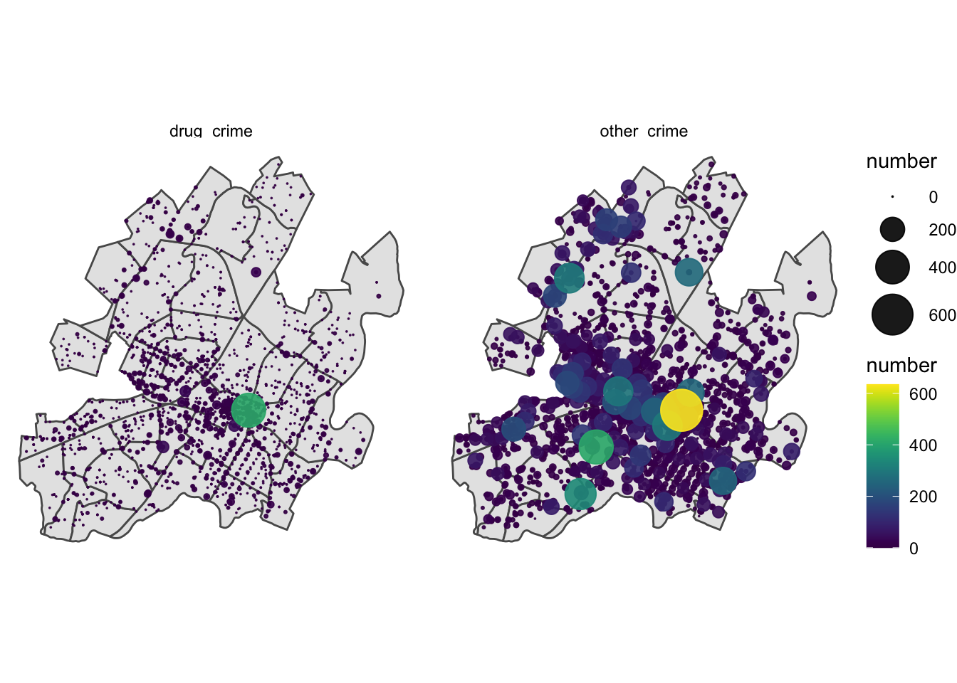
Again we see the concentration of crime in the downtown area, but we see one address downtown that dwarfs the others in frequency for both groups, let’s investigate what’s going on there.
arrange(address_summary, -number) %>% group_by(type) %>% slice(1)# 600 E Market St## Simple feature collection with 2 features and 3 fields
## geometry type: POINT
## dimension: XY
## bbox: xmin: -78.47746 ymin: 38.03041 xmax: -78.47746 ymax: 38.03041
## CRS: EPSG:4326
## # A tibble: 2 x 4
## # Groups: type [2]
## address geometry type number
## <chr> <POINT [°]> <chr> <int>
## 1 600 E MARKET ST Charlottesville VA (-78.47746 38.03041) drug_crime 410
## 2 600 E MARKET ST Charlottesville VA (-78.47746 38.03041) other_crime 635Something is going on in the 600 block of East Market, could it be the police station that’s located at 606 E Market St? Originally I wondered if this had something to do with the departments reporting practices, so SmartCville reached out to police department and they provided this response:
“…when individuals walk in to the police department to file a report the physical address of the department (606 E Market Street) is often used in that initial report if no other known address is available at the time. This is especially true for incidents of found or lost property near the downtown mall where there is no true known incident location. The same is true for any warrant services that result in a police report occurring at the police department.”
If it is this reporting process that is driving the increase in reports at the police station, we should see similar proportions for drug crime and all other crime.
station_props <- arrange(address_summary, -number) %>%
    group_by(type) %>%
    add_count(wt = number) %>%
    slice(1)

summarise(station_props, prop_total = number / n)## `summarise()` ungrouping output (override with `.groups` argument)## # A tibble: 2 x 2
## type prop_total
## <chr> <dbl>
## 1 drug_crime 0.222
## 2 other_crime 0.0218with(station_props, prop.test(number, n))##
## 2-sample test for equality of proportions with continuity correction
##
## data: number out of n
## X-squared = 2135.5, df = 1, p-value < 2.2e-16
## alternative hypothesis: two.sided
## 95 percent confidence interval:
## 0.1810225 0.2196687
## sample estimates:
## prop 1 prop 2
## 0.22210184 0.02175626The relative proportion of drug crime reported at the police station is much higher than that for other crimes. Maybe this significant difference is explained by the part about “charges resulting form warrant services”, but its +20% higher and that’s a lot of warrants.
Going forward I’ll drop the reports from 600 E Market so they don’t bias the anlysis, but I still think this detail deserves more attention, maybe a new reporting protocol.
Hot blocks
Crime tends to cluster and typically in the most urban areas, i.e. the places with the densest populations and the densest targets. Often just a single address or block is responsible for the majority of crime reported, this is called a “hot spot”. Becasue of this pattern, simply using total counts to find areas of of high criminal acivity, is not particularly useful.
So we need to use a normalization factor. The total number of crimes or the population could be good ones to find areas with more drug crime than expected.
# drop the police station to look at spatial trends in the community
crime %<>% filter(address != "600 E MARKET ST Charlottesville VA")

# summarise counts by census block
crime_sum <- st_set_geometry(crime, NULL) %>% # need to remove geometry property
    group_by(within, drug_flag) %>%
    count() %>%
    spread(drug_flag, n) %>% rowwise() %>%
    mutate(total = sum(drugs, not_drugs),
           frac_drugs = drugs / total)

# join rate info into census
census %<>% inner_join(crime_sum, by = c("objectid" = "within")) %>%
    mutate(capita_drugs = drugs / population)

# calculate city-wide rates
mean(census$frac_drugs)## [1] 0.0412699mean(census$capita_drugs)## [1] 0.03382426Let’s look at drug crime reported, in three different ways: raw counts, counts normalized to total crime, and counts normalized to population, for each census block group:
plot_list <- list()

plot_list[["total"]] <- ggplot(census) +
    geom_sf(aes(fill = drugs)) +
    scale_fill_viridis()  +
    coord_sf(crs = st_crs(census), datum = NA) +
    labs(fill = "total")

plot_list[["capita"]] <- ggplot(census) +
    geom_sf(aes(fill = capita_drugs)) +
    scale_fill_viridis() +
    coord_sf(crs = st_crs(census), datum = NA) +
    labs(fill = "per capita")

plot_list[["frac"]] <- ggplot(census) +
    geom_sf(aes(fill = frac_drugs)) +
    scale_fill_viridis() +
    coord_sf(crs = st_crs(census), datum = NA) +
    labs(fill = "proportion")

cowplot::plot_grid(cowplot::plot_grid(plotlist = plot_list[1:2]), plot_list[[3]], nrow = 2)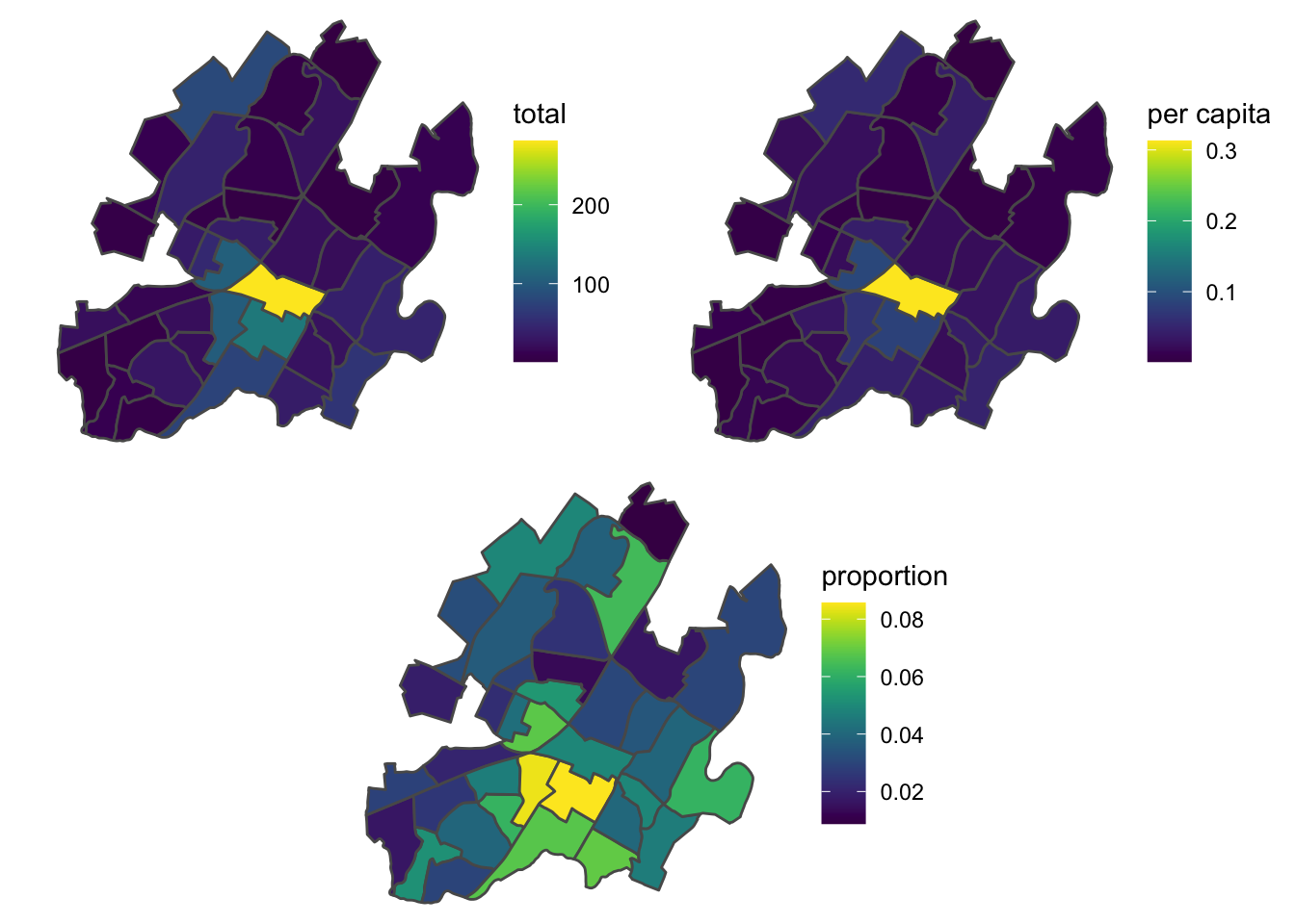
The raw counts and counts normalized to population show similar stories, with the downtown mall area being the most frequent block for reports. The census data reports 898 people leaving in the downtown mall census block, which seems a little low, but either way it doesn’t look like population is a useful normalizer.
The counts normalized to total crimes shows us a new pattern, with two adjacent census block groups where ~10% of the crime is drug related, well above the city average of 4.1%.
In order to get a better idea of what streets are included in each census block, we can replot the last “frac_drugs” plot as an interactive leaflet map, so we can zoom in and to get a better view. Leaflet is a really powerful JavaScript library (which has been ported to R), that is designed to build maps with layers of differnt data pieces, similar to ggplot2.
library(leaflet)

fill_pal <- pal <- colorNumeric("viridis", domain = census$frac_drugs)

leaflet(census, options = leafletOptions(minZoom = 12, max_zoom = 16)) %>%
    addProviderTiles("CartoDB.Positron") %>%
    addPolygons(color = ~fill_pal(frac_drugs), fillOpacity = .5,
                popup = ~paste0("drugs: ", drugs, "<br>",
                                "total: ", total)) %>%
    widgetframe::frameWidget(height = '400') # containerizes widgets so CSS properties don't interfer with page CSS
The two hot census blocks, are located along Cherry Avenue and 5th Street SW, just south of downtown. These adjacent areas are home to two of Charlottesville’s largest Section 9 housing developments and are likely some of the lowest income areas of the city. I have a follow up post planned for using American Community Survey data to expand on this idea and actualy get data to quanitfy this hypothesis that low-income area have more drug crime.
Hot grid
Suppose we want to get an idea of hot spots on a smaller scale. Instead of using the census block areas, we can construct a grid of our own, with st_make_grid(). This means we would lose normalization factors like population or income that are calculated by Census areas. Since counts normalized to total crime was a better metric, that doesn’t hurt us here but is worth noting.
grd <- st_make_grid(census, n = 20) %>% st_sf() # 20x20 evenly sized squares## although coordinates are longitude/latitude, st_relate_pattern assumes that they are planarggplot(census) +
geom_sf(fill = viridis_pal()(3)[3]) +
geom_sf(data = grd, fill = NA, color = viridis_pal()(3)[1]) +
coord_sf(crs = st_crs(census), datum = NA) # remove grid lines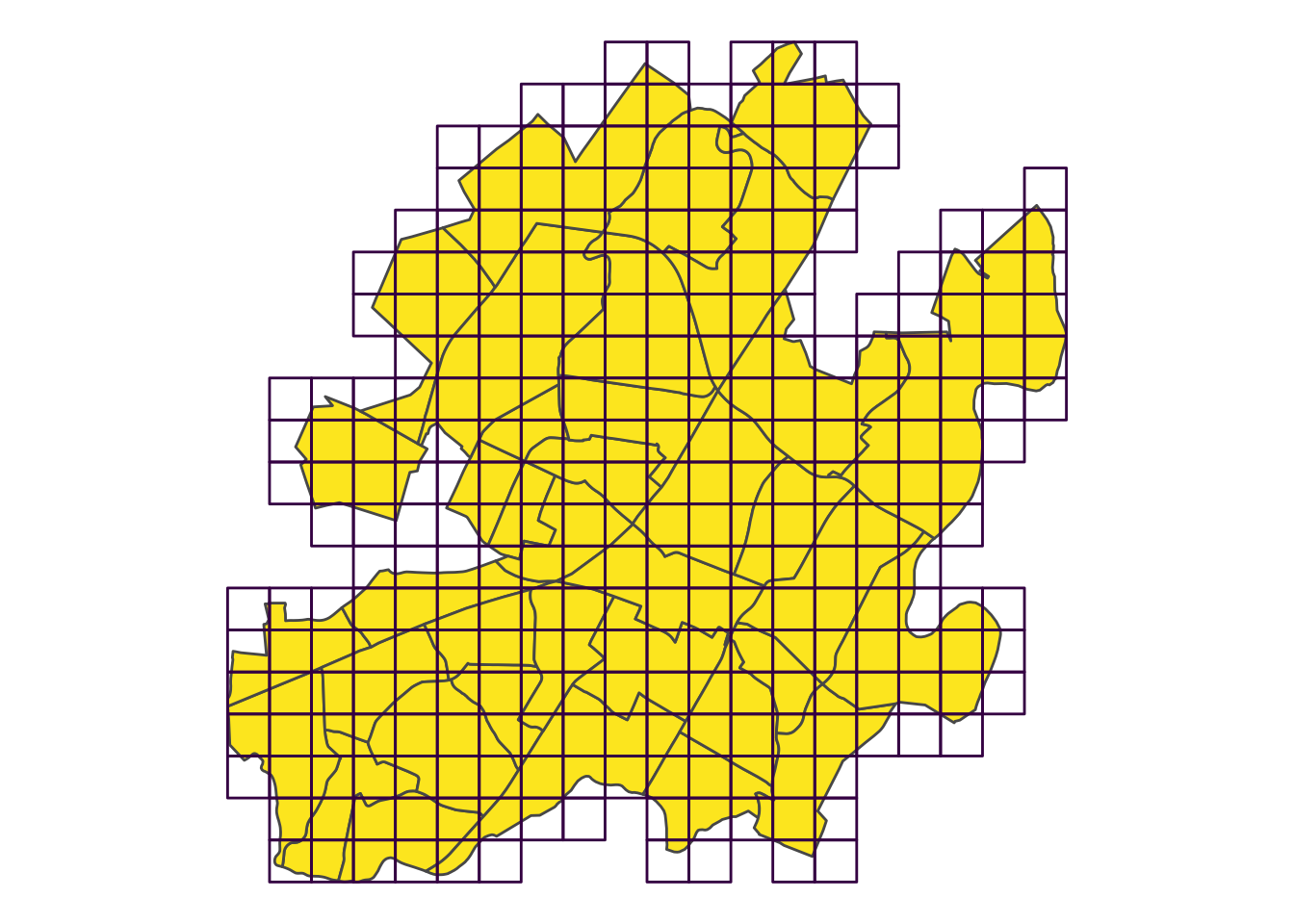
The inital grid fills the entire bounding box, i.e. the smallest rectangle that encompases the entire census map. This makes for a lot of grid squares that won’t have any data. Let’s remove the squares now, whose area doesn’t intersect with the area of the census blocks.
grd %<>% st_intersection(st_geometry(st_union(census))) # filter to those in census## although coordinates are longitude/latitude, st_intersection assumes that they are planarggplot(census) +
geom_sf(fill = viridis_pal()(3)[3]) +
geom_sf(data = grd, fill = NA, color = viridis_pal()(3)[1]) +
coord_sf(crs = st_crs(census), datum = NA) # remove grid lines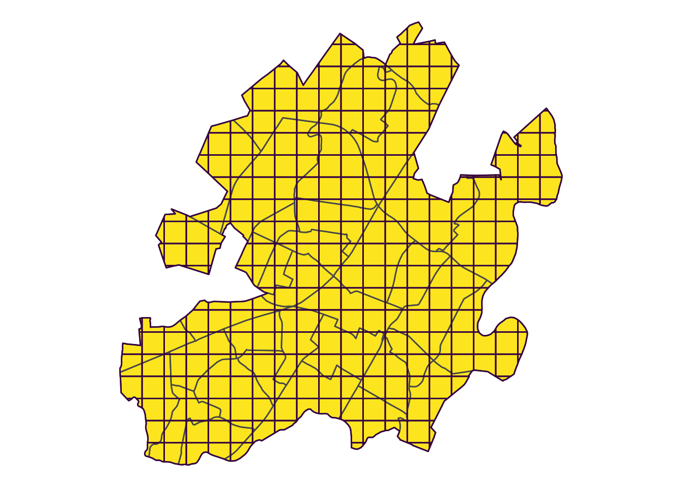
The helper functions for pairwise geometry comparisons, like st_within() and st_intersection() are other nice perks of the libary(sf) workflow.
All that’s left now is to caluculate the number of points within each square, and summarise them by drug related and total reports. This is the same series of functions we used before, just a new overlay geometries.
crime$grd <- st_within(crime, grd) %>% as.numeric()

grd_sum <- st_set_geometry(crime, NULL) %>% # need to remove geometry property
    group_by(grd, drug_flag) %>%
    count() %>%
    spread(drug_flag, n) %>% rowwise() %>%
    mutate(drugs = ifelse(is.na(drugs), 0, drugs), # some areas don't have drug related crime, recode from NA to 0
           total = sum(drugs, not_drugs, na.rm = TRUE),
           frac_drugs = drugs / total)

# join sumamry stats back into grd
grd %<>% set_names("geometry") %>% # sf functions look for geometry column
    mutate(grd = 1:nrow(.)) %>% # make a key to match back on
    full_join(grd_sum)
We did a little extra processing compared to earlier, because as we moved to smaller summary areas, we introduced more areas without crime reports. To imporove our visualiation, we recoded the ares with no drug crime from missing values to zeros. The area wihtout any crime reported are still treated as NAs.
bins <- c(0, .04, .08, .16, 1) # set custom bin breaks
grd_pal <- pal <- colorBin("viridis", domain = grd$frac_drugs, bins = bins) # important to rescale

leaflet(grd, options = leafletOptions(minZoom = 12, max_zoom = 16)) %>%
    addProviderTiles("CartoDB.Positron") %>%
    addPolygons(data = census, fill = NA, color = "black", weight = 1) %>%
    addPolygons(color = ~grd_pal(frac_drugs), stroke = FALSE, fillOpacity = .5,
                popup = ~paste0("drugs: ", drugs, "<br>",
                                "total: ", total)) %>%
    addLegend(pal = grd_pal, values = ~frac_drugs, opacity = .7, title = NULL,
              position = "bottomright", na.label = "no crimes") %>%
    widgetframe::frameWidget(height = '400')
The color scale is defined by my user defined bin system, designed to highligh areas below the city average and then setting breaks at 2x, 3x the average. Clicking on a given grid square will produce a pop up with the report totals.
We can see several of the hottest spots have very low numbers of total reports, helping produce high values for fraction of drug related offenses. The continuougs chunkg of green squares in the south-central covers the aread along Cherry Avenue between Tonsler and IX Park. The surrounding band of blue and green squares encompasing the south-western side of downtown, shows a similar pattern that the census block version did. But it also shows helps illustrate a larger area of higher than average drug crime extending south along 5th St.
The lone green grid on the north-central side of the city, covers Charlottesville High School and a small stretch of residential streets. There were 25 drug crimes reported there among 307 total crimes, making it one of the most frequent spots for criminal activity. Looks like Charlottesville’s reputatation for public school to prison pipeline, might have some data to back it up.
Wrap up
I hope this was a easy to follow use case for making pretty maps with library(sf). I like working with sf objects, becasue I can see the objects as a typical dataframes. So using all of my favorite tidyverse tricks is easy, and that makes me feel good. Word of caution, the integration isn’t seemless yet, but new versions are coming out rapidly, and I can’t wait to see it mature.
If you like this stuff, I’m helping with a Smart Cville Crime Data Deep Dive event on February 7th, and you should totally come.
If you have any feedback on this project or notice a typo or just have ideas about where data might be able to help Cville, let me know. Cheers!